Dealing with uncertainty
Sooner of later you will be faced with unfamiliar letter forms. Or a few letters and numbers may be so hard to decipher that you are not at all sure what you are looking at. This page offers some help on viewing the images, on understanding the hand-writing found in old registers and on how to enter information that you cannot be sure about.
As you gain experience as a transcriber, you will find it easier to recognise letters, digits and even words. You will also find a dedicated image viewer useful. For those parts of a register entry where you remain unsure, use our Uncertain Character Format: this enables you to enter as much information as possible, in a way that is compatible with a database search.
The problems
Register entries may be hard to read for a number of reasons.
- Firstly, the registers are old, perhaps several hundred years old, and they have not been kept in the best of environments: they are often faded and may be speckled with water marks. You may see further signs of damage.
- Secondly, they will have been photographed: few of us get to actually handle the original documents today. The process of photography may have introduced issues of focus and alignment that will make reading more difficult. (The registers are usually small bound documents that do not want to lie flat for their pictures to be taken!)
- Thirdly, the original records were written with unfamiliar instruments, usually a quill pen of some form, that give distinct characteristics to the letters and words.
- Fourthly, the education and writing skill of the clergyman or person writing the record was highly variable. Sometimes you will see good spelling and penmanship: at other times you will wonder.
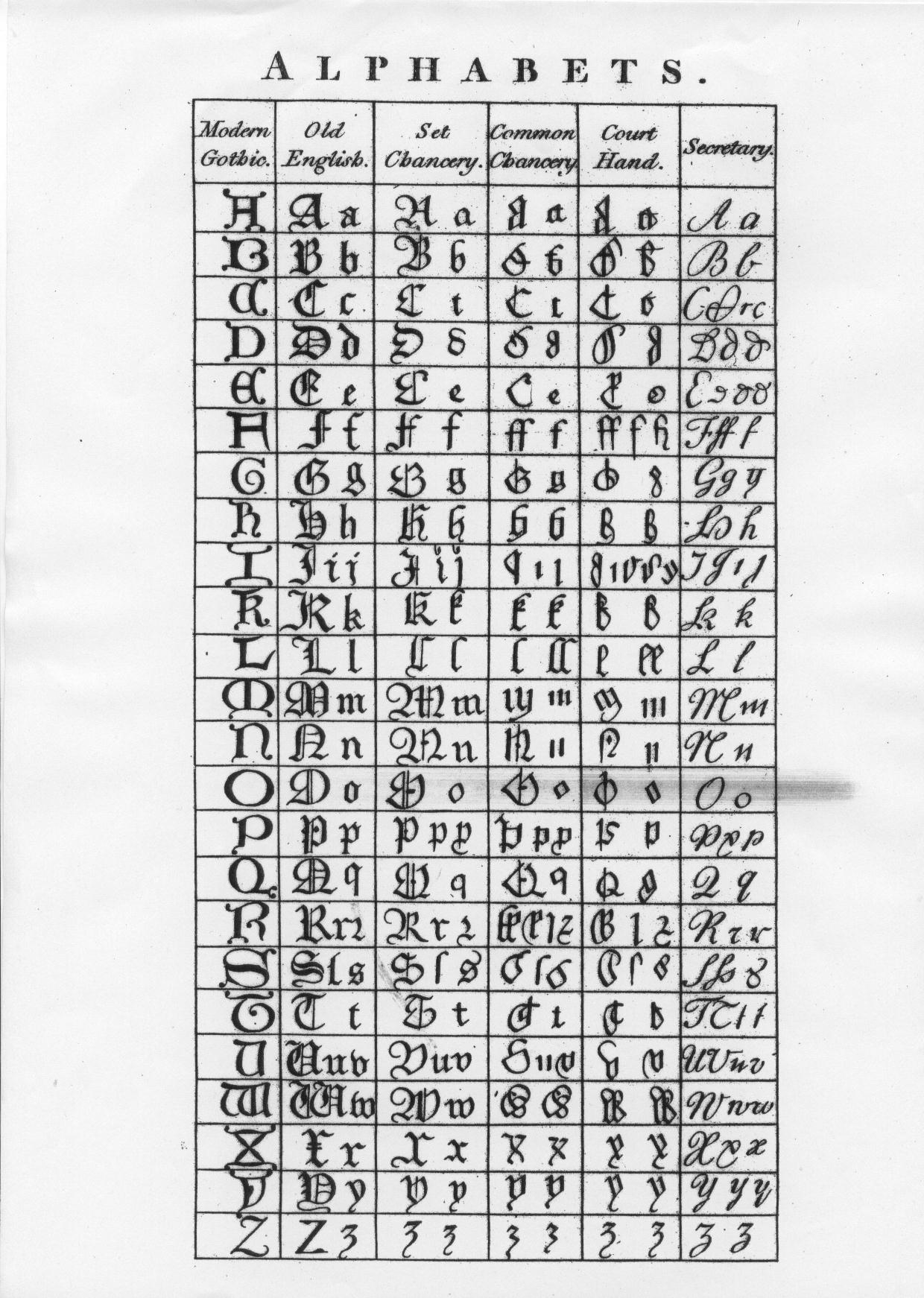
- Lastly, some of the letter and number forms that we use today are not the same as used in the past. (See the alphabet examples, below.)
Image viewers
Your computer no doubt came with a basic image viewer installed: this will be fine for working with good quality images. However, there are some more sophisticated (free) viewers out there that can be of practical help with reading images of poorer quality.
Viewers used by our volunteers include:
-
XnViewMP
- available for Windows, Mac and Linux
- current version (0.79) requires Mac OS newer than Snow Leopard
- not obvious whether or not older versions are still available
-
XnView
- Windows and Linux
-
GIMP 2
- for Windows, Mac, Linux and many others
- versions older than the current one are available, if needed
-
IrfanView
- Windows only
Improving readability
Do not expect miracles: a poor image can only be enhanced so much. And do be prepared to spend some time experimenting with the settings: there are many image variables to consider, as well as your particular screen and eyesight. The menu names given below are from GIMP 2: the other programs will use similar names.
The most generally useful options are:
- Zoom — bigger is not always better
- Colors menu > Brightness and Contrast
- if the image is dark, try increasing the brightness, in small steps
- if the writing is faint, try increasing the contrast, again in small steps
- Filter menu > Enhance > Sharpen — keep an eye on the preview as you adjust the setting
Although many images will be enhanced usefully by using the basic adjustments listed above, you might find some of the other options on the Colors menu helpful.
Uncertain Character Format (UCF)
Some common types of uncertainty that you are likely to encounter in your first few batches of transcription, and the technique to use for each of them, are given below. This is followed by more details of the format that we use.
Please note that there are some restrictions on your use of UCF in dates. See General guidance, Dates for details. These restrictions ensure that searching using a date range works effectively.
Some examples
- I can see one letter which could be an ‘l’ or a ‘t’.
- [lt]
- I can see one character which could be anything.
- _
(one underscore) - I can see two characters which could be anything.
- __
(two underscores) - I think the letter is a ‘b’.
- [b_]
- I see a group of characters that I cannot read — I do not know how many — or a missing name.
- *
- I can see two or three letters that I cannot read.
- _{2,3}
- I can see something which could be a letter or just an ink blot.
- _{0,1}
- I think I see the word ‘John’.
- John?
The format in detail
- _ (underscore)
- A single uncertain character. It could be anything but is definitely one character. It can be repeated for each uncertain character.
- * (asterisk)
- Several adjacent uncertain characters or a missing name. A single * is used when there are 1 or more adjacent uncertain characters. It is not used immediately before or after a _ or another *.
Note: If it is clear there is a space, then * * is used to represent 2 words, neither of which can be read. - [abc]
- A single character that could be any one of the contained characters and only those characters. There must be at least two characters between the brackets.
For example, [79] would mean either a 7 or a 9, whereas [C_] would mean a C or some other character. - {min,max}
- Repeat count of preceding character occurs somewhere between min and max times. max may be omitted, meaning there is no upper limit. So _{1,} would be equivalent to *, and _{0,1} means that it is unclear if there is any character.
- ?
- Sometimes you will be able to read all of the characters but remain uncertain of the word. In this case type a ? at the end of the word, e.g. RACHARD? However, the most frequent use of the ? is with transcripts that have been donated to us and then converted for entry into FreeREG.
Note: using a single * is preferable to spending a long time trying to decide the min and max values to use in the more precise _{min,max} format.
Technical note: although this UCF format has many similarities to regular expressions (as used in some office software, programming languages, Unix, etc.), it is not identical and in particular there is no escape mechanism.
Reading a register
Your first reaction on looking at a register, especially an older one, may well be to ask yourself how am I ever going to make sense of this. Your second reaction may be to ask yourself why am I doing this. Your third reaction might be to throw up your hands and walk away. Please do not. You are engaged in one of the most important activities designed to help all of us research our forebears. So please bear with it.
The following guidance will help you make sense of what you see. After a while you will come to recognise that old writing and surprise yourself at how good you have become. Also don't forget you can use our Uncertain Character Format (above) (UCF) to deal with the problem entries and move on.
The alphabet and its graphical representation
One of the biggest issues is how to read 16th century writing. We highlight many of the common issues below. Then if you want to, have a look at one or more of the resources available on the internet.
This set of tutorials is recommended by our transcribers:
The National Archives Palaeography Tutorials, where palaeography means deciphering historical handwriting
We suggest the following are also good sources of information and examples:
The following image gives an excellent rendition of some early alphabets and how people of different backgrounds wrote their text.

u and v
The first important thing to notice is that there were no separate characters for u and v. From the 1630s onwards, printers started to use the u letter-form (or ‘graph’) to denote the vowel, and the v graph to denote the consonant. Before this time there was only one recognised letter of the alphabet, which could be written or printed in two ways. This is why the letter w is called ‘double-u’ and not ‘double-v’.
Printers before the 1630s used v initially (at the start of a word) and u medially (away from the ends). Practice in manuscript (hand-written document) was never this consistent, with u and v graphs being used for both consonant and vowel, both initially and medially. Ambiguities caused by this system can make life difficult.
It’s important that you do not lose information by deciding too soon whether a u or v graph encountered is the vowel or consonant. Your job in transcribing is to report exactly what is there in the register, so u and v forms must be distinguished from each other where possible and not silently or subconsciously brought into line with modern practice.
i and j
As late as the nineteenth century, some still insisted that j was just a variant form of the letter i, which could represent both a vowel and a consonant. But many tried to use the j form for a consonant and the i for a vowel. You may even find j suffixed to a name, such as ‘Walterj’. Again, your job is to record what you see, which will in most cases be a letter i or j.
s and double-s
The ‘s’ is especially problematic. It has both long ‘s’ and short ‘s’ forms. The long ‘s’ is usually clear at the start of a word (fig. 1), but don't get the long ‘s’ and ‘f’ mixed up inside a word (fig. 2, fig. 3). Normally the ‘f’ will have a cross stroke, even if it’s hardly noticeable, and the context will make it clear whether it is a long ‘s’ or an ‘f’.
The terminal ‘s’ tends to fall between the two forms. See fig. 4–6.
Also look at the capital ‘H’ in fig. 6
Within a word the double-s is written with a long ‘s’ followed by a short ‘s’; looking like an fs.


Other letters
In secretary hand the lowercase ‘c’ looks exactly like a modern day ‘r’ (fig. 12).
The lower case ‘e’ tends to not have a central stroke, so can look more like a ‘c’, or an ‘o’ if it is biting with the next letter (fig. 7).
Also note the use of the double ‘f’ which stands for a capital F (fig. 8–9). It would be easy to mistake these as a modern H.
There are two forms of lower case r, the ‘2’-shaped one which occurs after ‘o’, and the long ‘r’ which descends below the line. The long ‘r’ can consist of no more than a single down stroke, with no horizontal stroke at all. This can make it quite hard to distinguish, particularly when combined with a preceding ‘e’.
You may come across the use of ‘es’ for the genitive (possessive), rather than apostrophe and ‘s’. For example, kinges. It may look like there is an apostrophe after the ‘e’, but what you can see is actually part of the letter ‘e’, called a ‘horn’ (fig. 10). Note also the form of the capital R in fig. 10.
The abbreviation sign that means characters have been omitted is a dash over the preceding vowel(s). See fig. 11–12. There is another example in abbreviations, lines over letters (below).
Note also the forms of the capital R in both these images.


Abbreviation marks and contractions
If you are transcribing documents created before the 19th century, you could find a lot of unfamiliar abbreviation marks and contractions, many of which have their roots in Latin and Greek texts.
The T.W.Y.S. (type what you see) rule still applies. However, to type some of these would require the use of special characters. This would be laborious and they would not be recognised properly when searching the database. So in these cases, transcribe the word in full, using UCF (Uncertain Character Format) together with a note if there is any degree of uncertainty as to what the abbreviation or contraction signifies.
P with an elaborate stem

The stem of the ‘P’ in figure 13 curls backwards over itself. This is a common abbreviation for Par- or Per-. Transcribe as P[ae]rking with a note to explain the UCF, for example — Start of surname abbreviated, probably Par- or Per-.
This abbreviation is also very commonly used for parish. Where the abbreviation is for a common word and there is no ambiguity as to its meaning, transcribe it in full with no note. For example, parish.
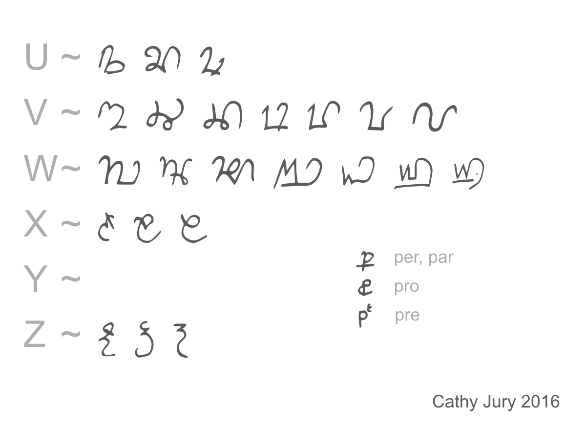
For further examples of abbreviations using a modified ‘P’ see the gallery of capital letters, U to Z (below).
Lines over letters

A curly line or straight line over a word is a more general form of abbreviation. In figure 14, where it lies above the single letter ‘m’, it almost certainly indicates a double ‘m’ — Clemmow. As there is some room for doubt, though, transcribe as Clem[m_]ow with a note, such as — Middle of surname abbreviated, probably –m-. Even for a common surname, do not guess, but rather suggest using UCF, together with a note to explain the abbreviation.
This type of superscript line is often used for the first name Ane (Anne), where the ‘n’ has a line over it to indicate a double ‘n’. Even with a common first name abbreviation however, there is still some ambiguity, so it should be transcribed using UCF for the second ‘n’ — An[n_]e — together with a note.
For a different example of lines over letters, see the alphabet, other letters (above).
Greek letters

Figure 15 is an example of the Greek letters XP used as an abbreviation for ‘Christ’, in this case as part of Christofer. Transcribe as Christofer, with a note such as — original Xpofer (the Greek letters ‘chi’ ‘rho’ are an abbreviation for Christ).

Figure 16 shows the same abbreviation used in Christian.
You could also see the Greek letter X (‘chi’) used by itself to stand for ‘Christ’.
The thorn

Figure 17 looks like ‘ye’, but the letter similar to a ‘y’ is a thorn (an abbreviation for ‘th’). There is a common misconception that ‘ye’ was an old form of ‘the’. This was never the case, so always transcribe as ‘the’, never as ‘ye’.

Figure 18 shows a contracted form of ‘the elder’, which should be included as a note, for example — father ‘thelder’ (the elder).
Further reading
Some useful reading with further examples of abbreviations used in Medieval times, but which also occur even as late as in 18th century documents:
- Nottingham University, guide to letter forms and abbreviations
- Bodleian Libraries, Secretary Hand abbreviations
- Harvard University, How to read medieval handwriting
Cathy Jury 2020
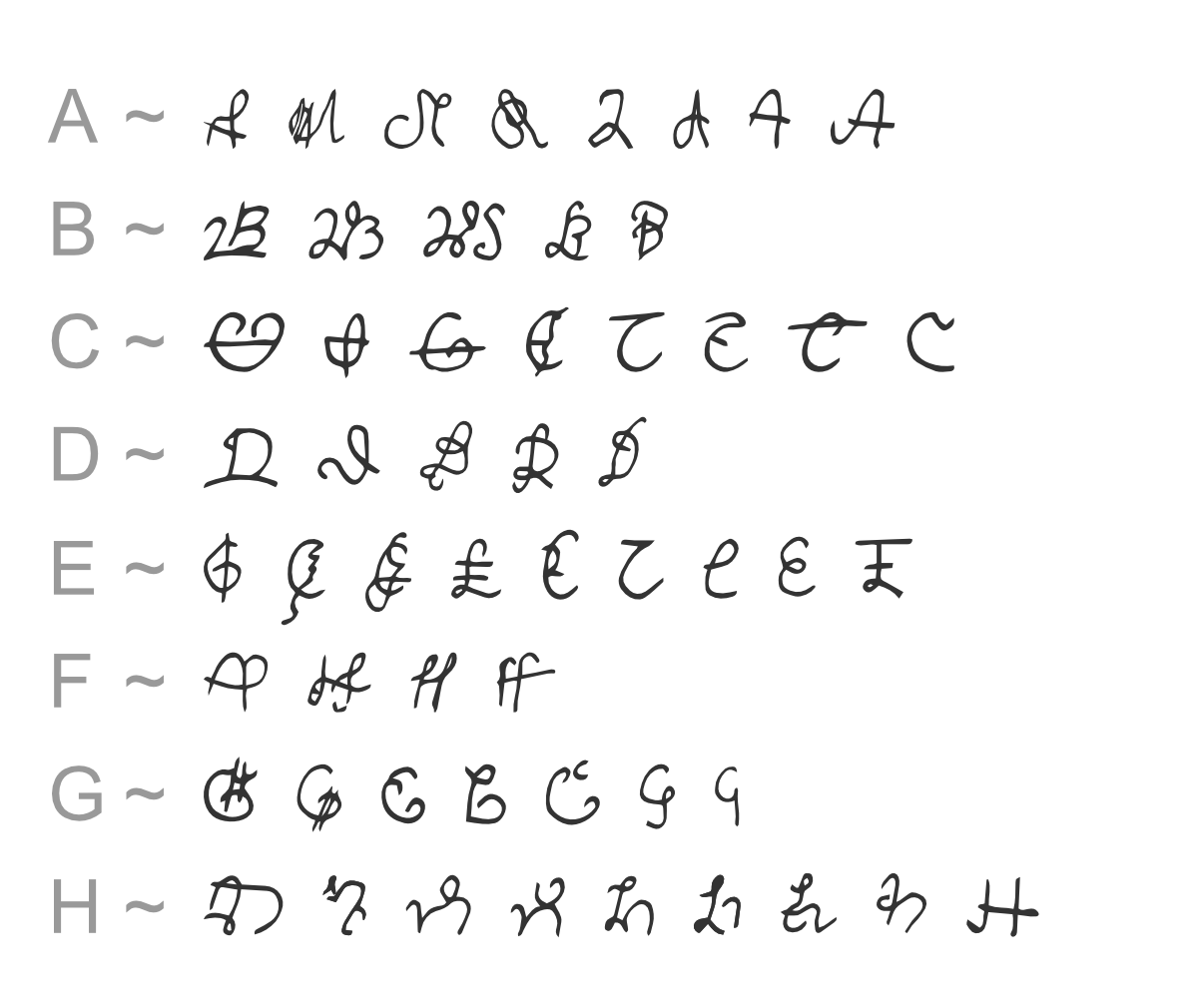
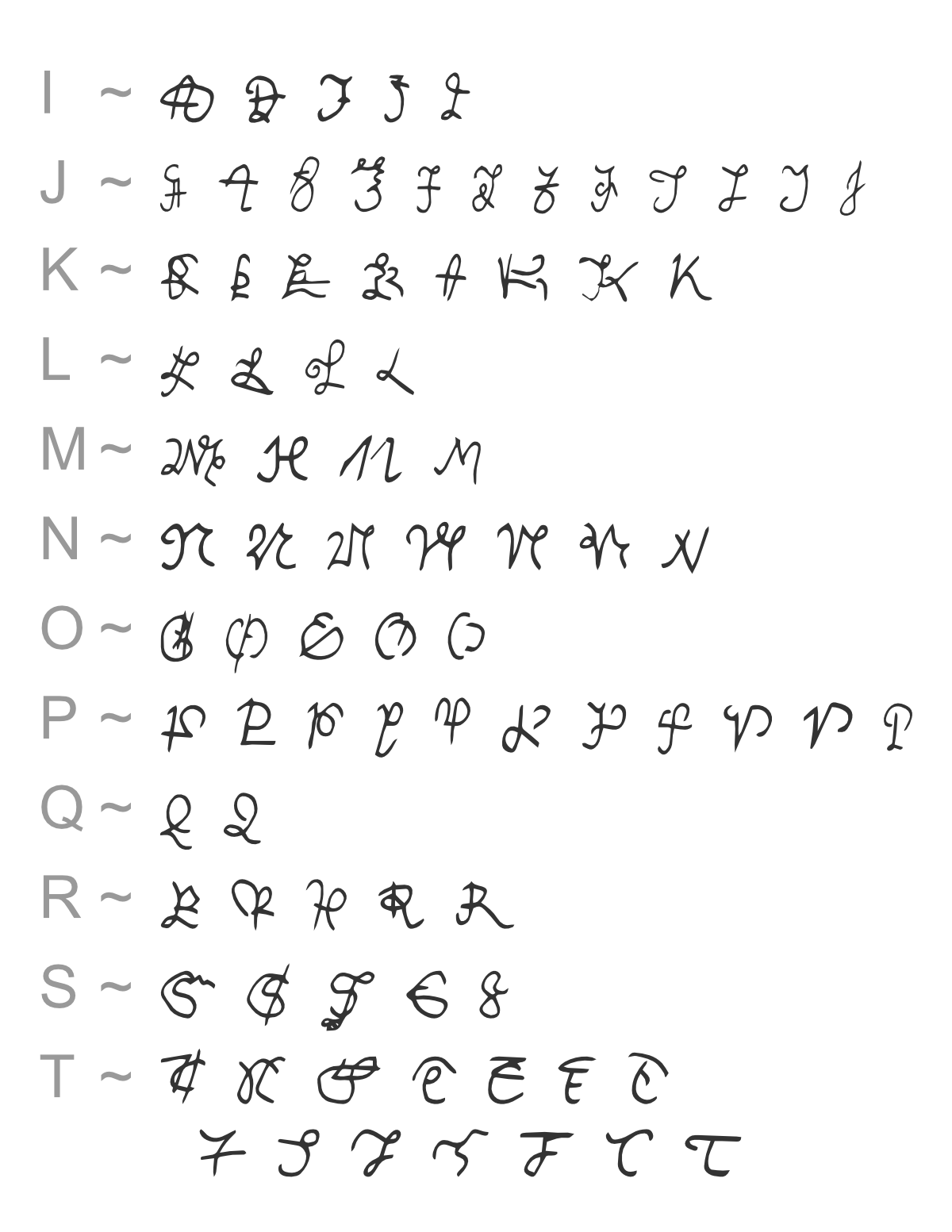
A gallery of capital letters
These capital letters have been collected by transcriber Cathy Jury. She writes —
Here are some of the more tricky capitals as used in the 16th, 17th and 18th centuries. There are various styles including Italic, Secretary, Cursive, Legal and Chancery. The styles were often used in combination, so they are listed together. Note that towards the start of this period, ‘I’ and ‘J’ were interchangeable, as were ‘U’ and ‘V’. At any time, the Greek letter ‘X’ was a common abbreviation for ‘Christ’, e.g. Xian (Christian).

Although they are listed separately, remember that towards the start of this period, ‘I’ and ‘J’ were interchangeable:

Remember that towards the start of this period, ‘U’ and ‘V’ were interchangeable:

These examples are not exhaustive: we plan to add others of interest, collected by other transcribers, in due course.